Walk any farmers market and the stalls people remember share one thing. Their products look like a family. Smaller food brands lean on label printing to pull that off, because matching labels across jars, bottles and boxes builds recognition long before anyone tastes what is inside. Shoppers buy what they remember. Simple as that.
One Look across Every Jar, Bottle and Box
Consistency Builds a Brand Faster than Ads: Quality label printing gives a small food business the same visual discipline the supermarket giants rely on. Logo in the same spot, colours that never wander. A shopper who loved the chilli jam spots the pasta sauce instantly, and that shortcut is worth more than most marketing budgets can buy.
Recognition Starts on the Shelf: Strong food labels act as the face of the whole range, tying a new product to ones customers already trust. Launching a fourth flavour gets easier when the first three built the pattern. People reach for the familiar. Especially in a crowded aisle where every jar is screaming for attention.
Colour, Shape and Finish Do the Selling
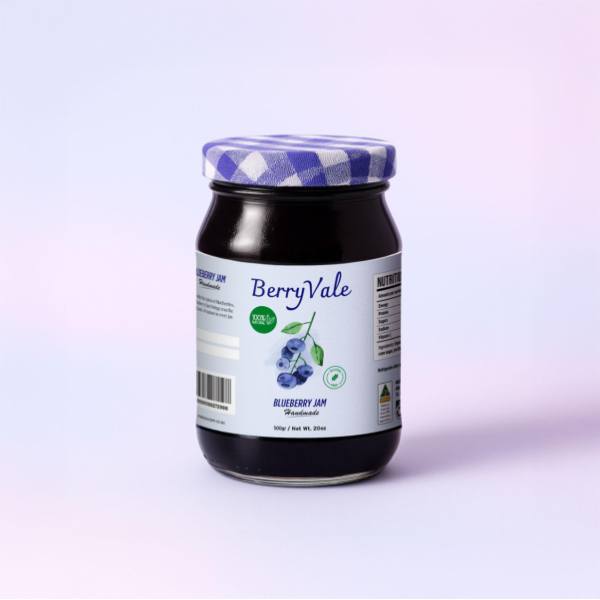
Materials Change the Message: Paper stock with a matte laminate whispers artisan. Gloss shouts fresh and bright, and waterproof synthetic stock keeps food labels looking sharp through fridges and cold storage. Shape matters too. A round label on a jar lid, a tall rectangle wrapped on a bottle, each choice quietly tells shoppers what kind of brand this is.
Colour Does Half the Work: Research into colour psychology backs what market stallholders already know. Warm reds wake up appetite, and deep greens read as wholesome. Picking a palette and sticking with it across the range does more for recall than any single clever design flourish ever will, even the expensive ones.
- Matte laminate suits handmade preserves and pantry lines
- Gloss makes bold artwork jump off the shelf
- Waterproof stock for anything headed to the fridge
- A metallic silver base creates a foil look on premium ranges
- Uncoated textured paper adds a handcrafted feel to specialty products
Templates, Artwork and Print That Keeps Its Promise
Full Colour without the Fuss: Modern digital printing reproduces photography, fine gradients and tiny type cleanly, so ambitious artwork survives the trip from screen to shelf. Design templates give newer brands a proper starting point, and full custom artwork suits anyone with a designer on call. Either path lands on the same press quality.
Small Print That Pulls Double Duty: Sharp label printing keeps ingredient lists, allergen notes and date marks legible while the branding does its thing above them. Compliance and personality can share one label. Getting both right protects a business from the sort of relabelling drama that eats margins and stalls a launch for weeks.
Make the Whole Range Instantly Yours
A recognisable food brand is mostly repetition done well. Pick the colours and finish that fit the product, then let every jar and bottle repeat the message until shoppers know it on sight. The tools for that are cheaper and simpler than most producers expect. Request a quote and start building a range people recognise.